Jamie McDonald: Klein and His Writing
Jamie McDonald first discovered Bernat Klein whilst studying for a Masters Degree in History at Edinburgh University. Here he reflects on his interest in Klein’s writing in Eye for Colour (1965) and Design Matters (1976).
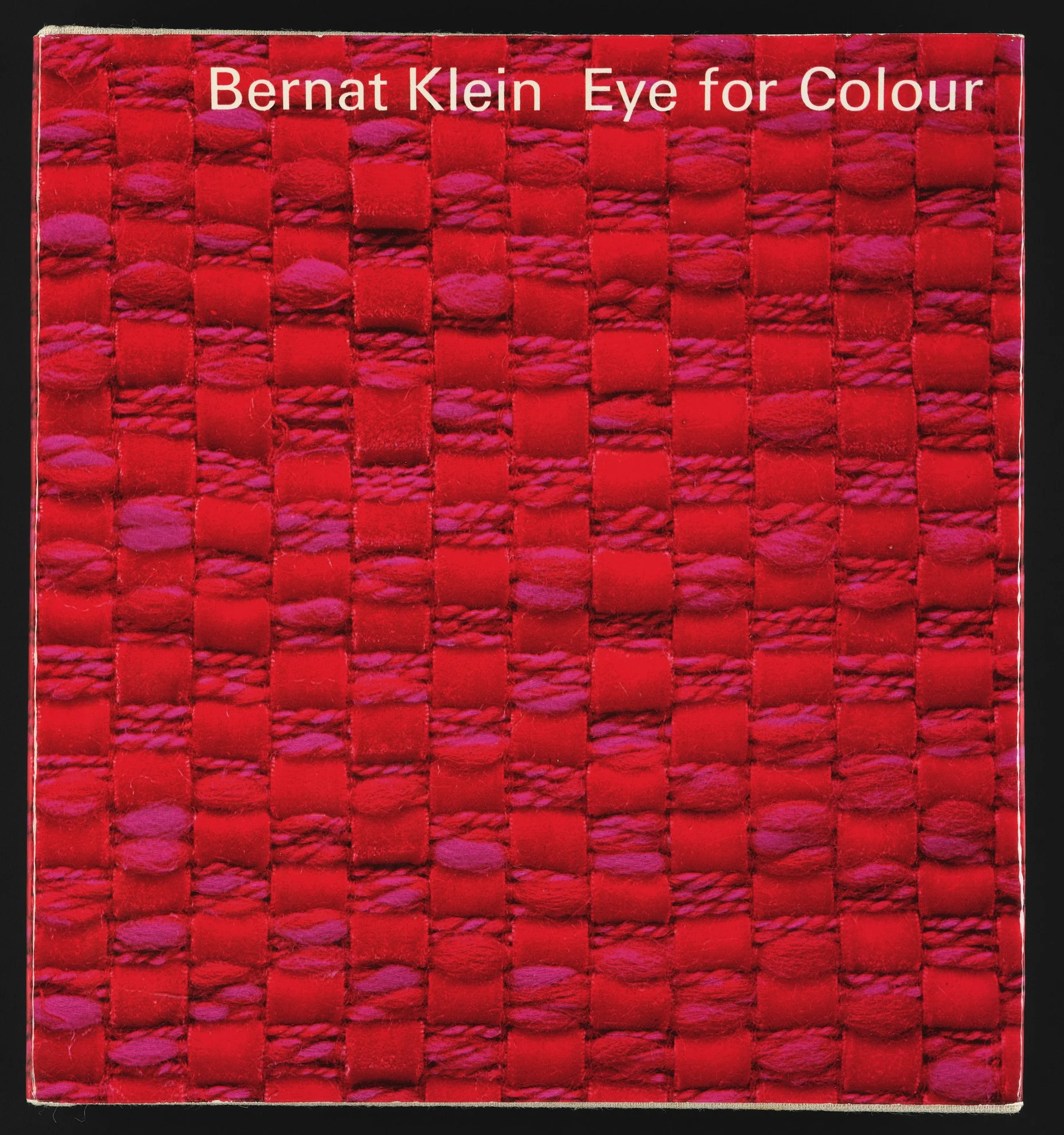
Bernat Klein and Collins, London, Eye for Colour, 1965; printed paper, hardback binding. Image courtesy of National Museums Scotland.
“What drew me to Bernat Klein was that he wrote extensively about his own work.”
Jamie McDonald, 2025
Klein published Eye for Colour in 1965 - in which he is primarily concerned with his thoughts on the textile market - and later, in 1976 Design Matters, a book-length essay on the state of British design. What I found interesting was that It is highly unusual to have such close access to a designer’s thought process.
However, read together both publications reveal Klein to be an extraordinarily widely-read artist - referencing essays on colour from Bauhaus masters Ittens and Kandinsky; and design icons like William Morris and Herbert Read.
Therefore, studying Klein’s written work in depth offers a wealth of insights into both his work and the mind of the designer in general. Klein is now best known for his complex, beautiful tweeds; but when he arrived in the UK in the early 1950s he encountered in the textile market, which he later observed in his writing.
“The most unpleasant yet strangely dull, teeth-grinding drabness”. ”
His reading of the Bauhaus masters, and of Morris and Read, appears to have been crucial in informing Klein’s analysis of the problem. The modern factory, with the potential to produce fabric with the greatest economic efficiency “must adapt itself to the artist”, writes Herbert Read, rather than letting market forces dominate artistic and consumer choice.
Bernat Klein, cover artwork for Design Matters , 1976; hand painted gouache on card. Image courtesy of National Museums Scotland.
In Design Matters, Klein reveals how deeply Read’s writing influenced his own view of the market, asking if the public chose bad design only because it ‘had and has no alternative’. He argues this amounts to the largest textile firms, harnessing the power of the factory to undercut more thoughtful designers, holding a “monopoly on taste”.
It was the Bauhaus masters who Klein turned to for an answer to this problem. Johannes Ittens - who wroteThe Art of Color and favoured by Klein - developed theories to demonstrate the value of colour, and to inform its use.
“It was Ittens’ writings which were to teach Klein not only about the use of colour but also about the centrality of the artist to the design process.”
The view of that period was that the most satisfying colours could only be chosen if the artist has the freedom to choose them. With the artist and designer in control, their innate skill and training can produce pleasing and beautiful products free from what might be seen as the tyranny of the ledger-book or the bottom line.
Klein’s initial attempts to inject colour and taste into the British market were - he admits - missteps. He fell into a “resigned tendency” to simply make new versions of existing products. It wasn’t work he cherished, writing that “I enjoy designing new cloths much more than I should enjoy making grey flannel”.
In 1954, however, during a visit to London’s Tate Britain gallery, Klein saw Georges Seurat’s Une Baignade, Asnières, (Bathers at Asnières). The encounter would have a profound effect on him.
““Of Seurat… and of his colours and textures I could only dream. I wanted reds that were redder and blues that were bluer than anything I had seen before and I wanted to see cloth in many colours that had never been attempted before”. ”
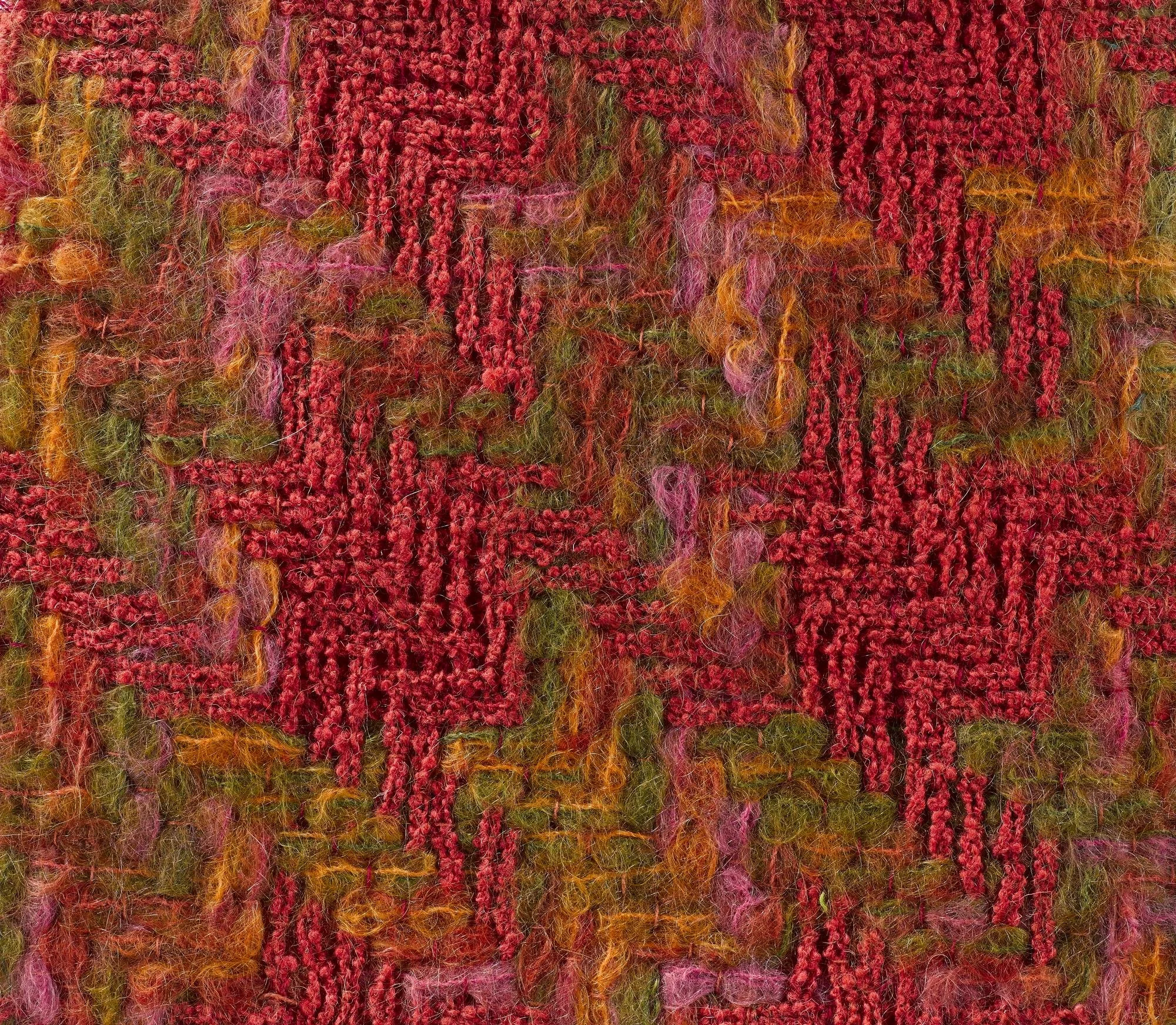
‘Rose’ (detail), Bernat Klein, c.1961; brushed space-dyed mohair fabric, the first used by Chanel in 1962 and more fully illustrated in Eye for Colour , p.125. Image ©Bernat Klein Foundation.
Seurat’s secret was pointillism: the art of placing thousands of tiny dots of pure colour on a canvas to produce an overall effect - much like pixels on a screen. The artist left it to the viewer, which Klein described as “the task of reconstituting the hues as an ‘optical mixture’”. Standing back from the canvas, human perception blends the pure colours, producing shades in the same way the eye does when looking at the original scene. The neo-impressionists, the movement Seurat was a part of, defended this - at the time controversial - approach, arguing that if “nature does not mix her colours to produce a tone”, then why should painters?
Bernat Klein colour board (detail), 1960 - 73; hardboard, paper, and space-dyed mohair yarn. Image courtesy of National Museums Scotland.
Klein immediately understood the potential for pointillism in fabric design. He realised “if many colours were carefully combined”, the viewer would be able to “add them all up together” themselves, in the same way the viewer of a pointillist painting would.
‘Brazil’ Bernat Klein Tweed c.1963 - 1965. Image courtesy of National Museums Scotland.
Klein’s encounter with Seurat is an excellent demonstration of the value of his intellectual development as an artist. His understanding of colour theory, paired with his ability to pinpoint a gap in the textile market, led to the development of a totally new technique. Calling his innovation ‘space-dyeing’, Klein dyed four skeins of yarn in four sections, allowing the colours to bleed together and create four brand-new colours in-between the original dyed segments. As an artist, colour was influenced by his own abstract oil paintings inspired by the Scottish landscape and its tones and hues he observed from his own window.
“Woven together, this technique produced the first real breakthrough in colour and design technique in fifty years.”
‘Quince’ Bernat Klein Tweed c.1962 - 1964. Image courtesy of National Museums Scotland.
The tweeds were a phenomenal success. The Evening Standard remarked with surprise that the “prettiest” fabrics shown at the fashion shows that year were Scottish - Klein tweeds. The Guardian called the tweeds “blazingly coloured”. Princess Margaret wore Klein tweeds on her trip to America in 1965.
To Klein’s delight, the fabrics were picked up by Coco Chanel for a collection in the early 1960s, a sale that he later described in Eye for Colour as leaving him “too excited to speak”.
Klein’s intellectual development was central to his decision to create, produce, and sell these tweeds. Without his understanding of industrialisation, his distaste for the British textile market may have simmered only as distaste. Without his understanding of colour theory, he would never have been able to develop a brand-new dying technique and produce his dazzling tweeds. And without his appreciation of art, witnessing Seurat’s pointillism in person, he may not have had the idea to begin with.
Most importantly, Klein’s books mean his tweeds need not remain a mystery to us. Thanks to Klein writing about his inspiration, his techniques, and his intellectual development in such depth, we can not only learn more about the period in which he worked, but also develop our own artistic education and understanding as well.
The consumption and production of writing about art is an essential companion to the consumption and production of art itself.
Bernat Klein garment label (front) 1973 - 92, printed paper. Image courtesy of National Museums Scotland.
References
Bernat Klein, Design Matters, 1976.
Herbert Read, Art and Industry, 1956.
Shelley Klein, The See-Through House, 2022.
Bernat Klein, Eye for Colour, 1965.
William Innes Homer, Seurat and the Science of Painting, Cambridge: Massachusetts Institute of Technology, 1964.
Schoeser /Harley, Bernat Klein, Glasgow: Bernat Klein Foundation, 2022.
Fiona MacCarthy, ‘Getting weaving with colour’, The Guardian, 17 September, 1965.
Jacqueline Field, ‘Transatlantic Fashion Fabrics’ in ed. Mary Schoeser and Alison Harley, Bernat Klein, Glasgow: Bernat Klein Foundation, 2022.
Anne Burdick, https://www.eyemagazine.com/opinion/article/what-has-writing-got-to-do-with-design


